7 Easy Steps To Master the Art of Newsletter Signup
Email marketing is alive and well in 2020. While some may say the opposite, statistics show that email marketing is still one of the most cost-effective digital marketing strategies to engage with your audience and increase your conversions.
Based on DMA’s report, the power of emails is undeniable as email ROI has climbed from $48 to $55 for every $1 spent. With that in mind, every online business should discover new ways to leverage the power of emails.
However, to enjoy the benefits of email marketing, you first need to build a mailing list. This is where newsletter signup comes in.
As you know, you can provide a way for your audience to subscribe to your newsletter right on the homepage of your website. But what if I told you that there’s more to it?
In this article, we’ll look at how to create the best newsletter signup, from the copy and design to the right form and value. But before we do that, let’s go over some important details.
Newsletter Signup Defined
When we talk about newsletter signup, we’re referring to a process by which visitors elect to receive updates from an online business through email.
By using an email newsletter signup form, visitors can enter their personal information and email address and hit subscribe.
Newsletter signup is a core component of every successful email marketing strategy. Since online businesses can’t establish bonds as brick-and-mortar stores do, they need a reliable channel to engage with their target audience and incentivize them to buy their products.
Subscribers: Why Do We Need Them?
Promoting your online business through various channels will help you increase your online store visibility. However, a paid ad on social media will only attract attention for a limited amount of time.
What you need to ensure the long-term growth of your business is a nurtured audience that receives updates from you and takes action throughout their customer journey. Let’s look at some of the benefits of building your email list.
1. Expand your target audience.
Every business has a unique customer base. If you already have a seasoned business, then you know that identifying and expanding your target audience is necessary to get to the next level of success.
For newer businesses, though, expanding your target audience can be a difficult task at first. That’s where newsletter signup comes in to make things easier.
Allowing your visitors to sign up for your newsletter will help you better understand your target audience and help you identify the right strategies and techniques to boost your lead generation.
Getting more subscribers and targeting them with the right content can be your secret weapon to boost your engagement and skyrocket your ecommerce store’s revenue long term.
So, to achieve these goals, you need to leverage the power of email newsletter signup and get more subscribers aboard your ecommerce store.
Also, keep in mind that not every subscriber of yours will be equally interested in your brand at first. Targeting them with the right content, though, will show them the benefit of buying from you and lead them a step closer to conversion.
2. Build relationships with potential customers.
Getting one-time buyers will help you go fast, but to go far you need loyal customers who’ll return to shop again and again.
Turning consumers into your customers, though, can’t happen overnight. If you want to succeed, you need to show them the value of buying from your ecommerce business rather than your competitors’ stores.
If you turn a browsing shopper into a newsletter subscriber, think of it as the first step to turning them into a customer.
After they join your mailing list, you can start building relationships, sending email campaigns that will get them engaged with your brand and show the benefit of buying from you.
The more you target them with tailored content, the easier you’ll nurture your subscribers. As a result, your new bond will help you lead them a step further down your marketing and sales funnels.
Why Do You Need An Effective Newsletter Signup Form?
A great mailing list is key to a successful email marketing effort that nurtures and converts subscribers into loyal customers. Newsletter signup is a no-brainer for email list building. An effective newsletter signup form will allow you to create and expand your mailing list in the most cost-effective way.
However, to get from lead generation to world domination, you need to have an effective newsletter signup form. Why? Because a great newsletter signup form with an offer or a giveaway will boost your subscriber count and allow you to collect valuable data.
For instance, a form will enable you to segment your subscribers based on their demographics, helping you deliver more targeted — and thereby, more effective — messages.
Here’s an email newsletter signup example from Converse:
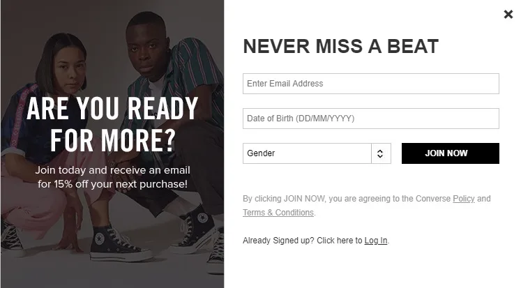
By including the right input fields, you’ll get to know your audience, which will improve content marketing efforts by providing insights into their preferences and interests. Better targeting your audience with tailored content will push them a step further down your marketing funnel.
Convenient and easy to create, newsletter signup forms are a content marketer’s best friend in enhancing your business development.
Before we get to the form creation part, let’s see the best types you can use.
5 Types of Newsletter Signup Forms
For an effective newsletter signup form, you need to choose the best type for your business, customize it accordingly, and display it on your homepage.
If you’re already using a form builder, you’re probably familiar with some of the most popular forms out there — but let’s take a look:
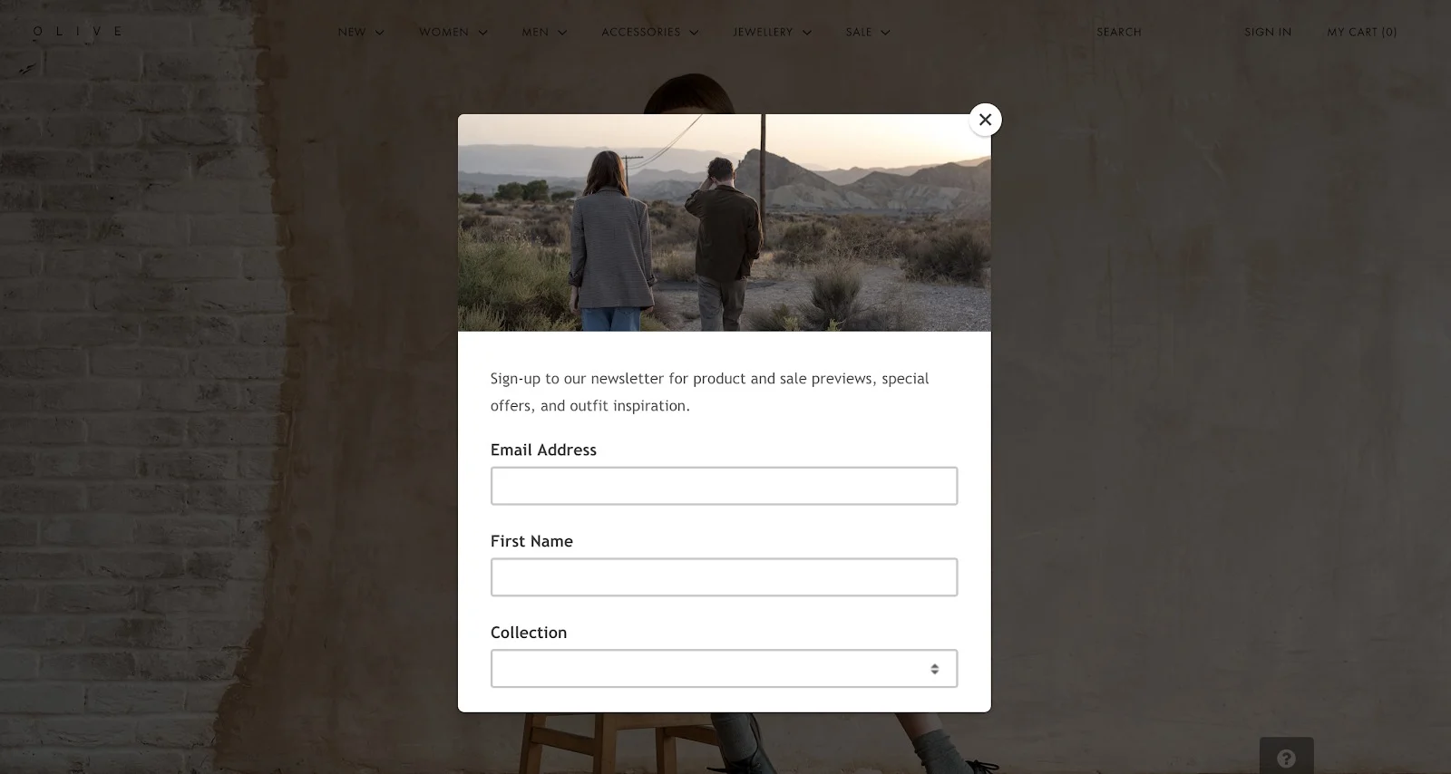
1. The modal pop-up newsletter signup form.
The modal pop-up is one of the most common newsletter signup forms utilized by the majority of online businesses.
Pop-ups are great at surprising your visitors with an incentive, usually in the form of a signup offer.
Here’s an example from Olive, a UK fashion brand, that pops up upon arrival on the brand’s homepage:
2. The inline newsletter signup form.
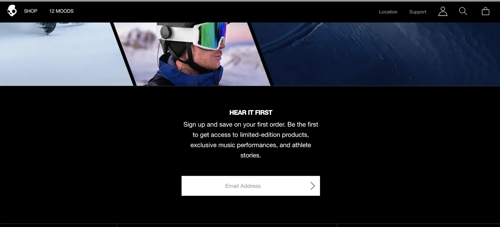
Inline forms are more discreet than modal pop-ups, as they are embedded in your page with the rest of your content.
While inline forms are commonly used in blog posts to minimize distractions, you can also use them as part of your store’s signup strategy.
Discreet, inline forms with great offers can help you capture your visitors’ attention without being distracting or causing friction.
Here’s an email newsletter signup form from Skullcandy:
3. The floating bar newsletter signup form.
Floating bars are even more discreet than their cousin, the inline form. The floating bar is a slim horizontal bar at the top of the screen that many know as the “hello bar.”
While discreet, floating bars will help you capture your visitors the moment they land on your homepage. Use that opportunity to convince them to sign up, with a stellar copy that effectively shows the value of your newsletter.
Here’s an example from Buffer:

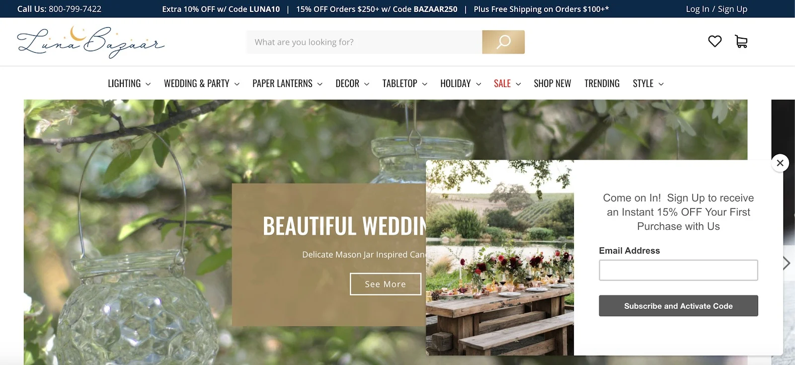
4. The floating box newsletter signup form.
The floating box is similar to the modal pop-up. However, this form type has a secret weapon to convert more visitors into newsletter subscribers.
Floating boxes are sticky — that means they’ll stick with, or follow, your visitor as they scroll up and down on your homepage.
Here’s an example from Luna Bazaar featuring an irresistible signup offer:
5. The full-page newsletter signup form.
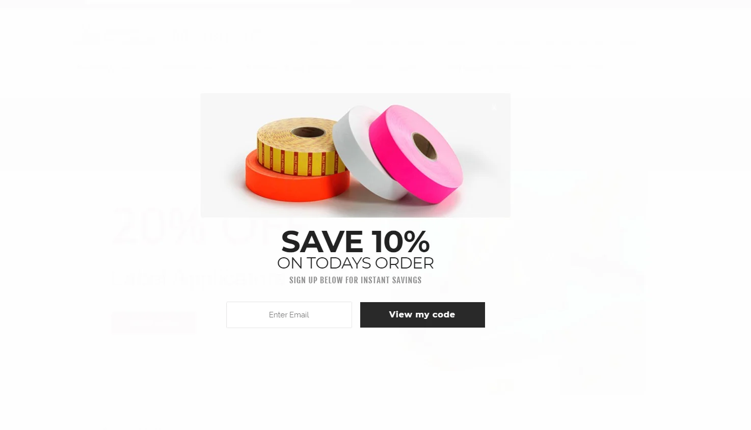
Last but not least, we have the full-page form. Compared to the rest of the form types, this one covers the entire page — making it hard to miss.
Full-page forms are impossible to ignore, making them a great tactic for capturing your visitors’ attention.
Here’s an example from Avery Dennison’s ShopMonarch that appears upon landing on the homepage:
How to Create a High-Converting Newsletter Signup Form
Capturing your visitors’ attention with the right newsletter signup form isn’t enough to turn them into newsletter subscribers.
To do that, here are the elements to keep in mind to create the ultimate newsletter signup and boost your customer lifecycle marketing endeavors.
1. Favor simple copy over complexity.
As Leonardo da Vinci once said, “Simplicity is the ultimate sophistication.”
As a content marketer, you might think that simplicity couldn’t be effective, but design trends show that simple concepts convert better than complex ones.
According to the Harvard Business Review, 86% of consumers were more likely to buy from brands that favored simplicity in all aspects of their marketing endeavors.
With this in mind, you can see that consumers want brands to be straightforward and honest. Projecting a clear message during signup will minimize unsubscribes and boost overall engagement.
A simple copy will help your visitors truly hear and understand your message. Furthermore, taking into account consumers’ short attention span, your copy should be just long enough to convince your prospect to sign up.
The power in an effective combination of the quality and quantity of your signup copy is undeniable.
According to a Crazyegg A/B test of the two variants of newsletter signup copy, the version lighter on copy performed better than the one with more.High Beauty email newsletter signup example.

High Beaty exemplifies an email newsletter signup form that’s both simple and elegant.
Using a pleasing, on-brand color combination that aligns with their homepage, High Beauty manages to highlight the perks of joining their newsletter in one short but meaningful sentence — with a great play on words.
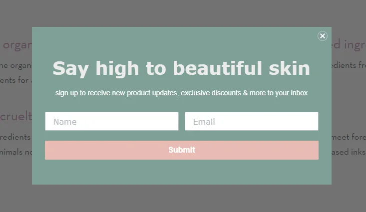
It’s also worth mentioning — this brand loves to use brand-relevant puns to entertain its visitors. In this case, using one in the headline elevates the brand’s signup page by making it playful, interesting, and fun, all while reinforcing their brand voice.
2. Set up a newsletter signup confirmation.
When your visitors submit their signup page, they expect some sort of confirmation that the signup was successful.
Confirming their subscription will contribute to a positive experience with your brand.
However, as great as your confirmation message might be, some subscribers won’t spend their limited attention on reading it, hurrying to close the message. This may lead to unconfirmed email addresses and unengaged subscribers.
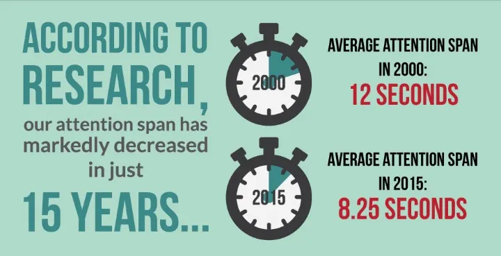
Instead, invest in a subscription confirmation email to guide your new subscribers through the process.
The benefits of a confirmation email, though, go beyond combating your new newsletter subscribers’ absentmindedness. A well-designed confirmation serves as a positive first touchpoint before your welcome emails arrive.
To set up your confirmation and welcome emails, leverage the power of an email marketing platform that will offer you all the right tools to succeed.
Choosing the right platform for your business, though, can be a challenge. Consider testing a variety of free email marketing services before deciding which is best for you.
Wendell August Forge website confirmation message example.
The easiest way to confirm a subscription is to display a confirmation message like this one from Wendell August Forge:
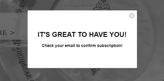
Confirmation messages must be simple. Something like “You’re in!” or “It’s great to have you!” will show your subscribers that their signup process was successful and serve as the first step to ushering them into your brand community.
What’s more, confirmation messages are a great way to remind them to verify their email address before they receive your newsletter.
Zooplus newsletter signup confirmation email example.
Zooplus has created a beautiful newsletter signup email with clear next steps.
The brand grabs the opportunity to welcome new members with a signup offer and further information on how to unsubscribe.
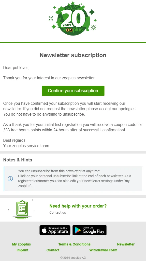
While confirmation emails are usually short, including a link to your page and rewarding subscribers with a special offer provides an opportunity to engage with your audience the moment they sign up.
Keep in mind that if you create a confirmation message like this, it should be as informative as possible. Give your “accidental subscribers” a clear way to unsubscribe.
3. Create intriguing newsletter signup form designs.
As we said, even the simplest forms can do the trick and effectively help you expand your mailing list.
However, simple doesn’t have to mean a plain white background with a black and white call to action. To create the best email newsletter signup form, you need to come up with an online form design that is intriguing and memorable.
Your visual elements, your color combinations, and your copy are all critical. Combine these elements, with simplicity in mind, and nail the forms to help your mailing list grow.
According to a Nielsen Norman Group report, visitors only need 10 seconds to form an opinion when they land on your homepage.
So, creating an email newsletter signup form that will show them the real value, attract their attention, and incentivize them to join should all happen in just a few seconds.
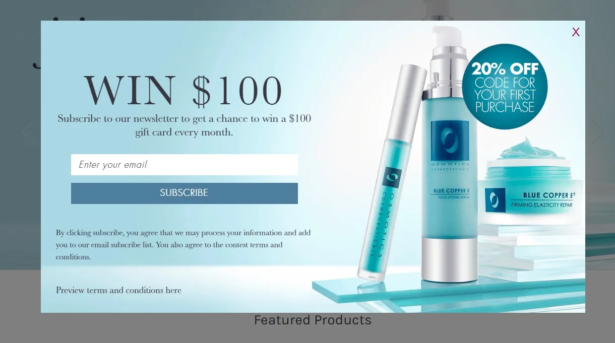
Osmotics email newsletter signup example.
Osmotics is a brand with high-quality skincare products. To get their visitors to subscribe, the brand has created an effective newsletter signup form that’s hard to resist.
Using beautiful images of their products and pleasing color tones, the brand creates an incredible design where all elements are in perfect balance.
From the colors and visuals to the irresistible giveaway and first-time discount, Osmotics delivers an authentic ecommerce customer experience that’s hard to resist.
4. Make your calls to action (CTAs) stand out.
Your CTAs are the most important elements to pay attention to when you create your newsletter signup.
A clear, easy-to-spot CTA with the right message will give your potential newsletter subscribers the confidence to click.
But when it comes to creating CTA buttons, there are a number of mistakes that can reduce the efficacy of your signup page. For instance, picking the wrong elements is one of the rookie mistakes of creating signup forms.
If you want to have the best newsletter signup, then you need attractive CTAs that will convince your visitor to subscribe.
Use the right copy.
When content marketers create newsletter signup forms, they sometimes spend more time on design and visuals — while neglecting CTA copy.
If you can deliver a compelling message through a short CTA, you will increase your newsletter signup rate.
Strong CTA copy shows the immediate benefit of joining, the moment they find themselves on your homepage.
Spoon Graphics email newsletter signup example.
Instead of using common CTA copy like “Submit,” or “Join Now,” Spoon Graphics opts for a copy that employs direct and personal language.
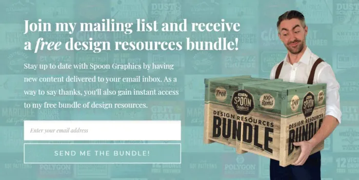
But that’s not the only thing that makes it the perfect CTA button. It perfectly complements both the form copy and the visual design, creating an attractive signup page that will increase the brand’s newsletter subscribers.
Leveraging the power of giveaways will boost your newsletter signup rate and turn your form into the ultimate subscription generator.
Use the right colors.
While Spoon Graphics delivers an amazing newsletter signup form, one improvement could have been to the color of their CTA box.
As you can see in the above example, choosing similar colors will reduce contrast — thereby reducing the readability of your CTA. A frustrated or uninterested visitor will close your signup form and leave without joining your mailing list.
To make them click, your CTA box must stand out as much as possible. But how do you find the best colors to achieve it? Are there specific combinations that you should take into account?
The most important thing is to take advantage of the white space. Then, use an understanding of color psychology to determine what colors are best for you. Research has shown that some colors, like red, green, and blue, are more likely to boost your CTA visibility than others.
Choose your CTA colors carefully. If you want to stand out, find the colors that will work in harmony with your form and boost your CTA visibility.
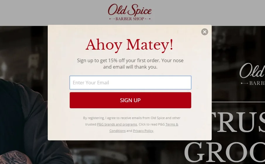
Old Spice email newsletter signup example.
Old Spice uses a bright red CTA box underneath the input field.
Taking advantage of the white space, the brand has managed to turn its button into a powerful attention magnet.
Selecting the right colors for your CTA is of paramount importance to nail your signup page every single time.
So, before you release your form, take a moment to see if your buttons are attractive and interesting enough to capture your attention.
If they don’t work on you, they might not work on your potential subscribers either.
5. Offer an amazing reward.
We’ve seen that forms need a fabulous design to convince your audience to convert. But beautiful designs and compelling copy aren’t the only ways to newsletter signup success.
Potential newsletter subscribers need to see how much you appreciate and value them.
Especially for ecommerce stores, the best way to increase your newsletter subscriber count is through irresistible digital coupons, signup offers, and giveaways.
Discounts are extremely popular for first-time buyers; they’ll often sign up just to benefit from your 15% discount offer.
After all, studies show that 80% of American consumers feel encouraged to make a purchase from a new store if they find a great offer or discount.
To leverage this practice, you should use your headline to make your first-time purchase discount your form’s main message. Just keep in mind that, to prevent your subscribers from unsubscribing, you need to provide more exclusive offers throughout the customer journey.
Wendell August Forge email newsletter signup example.
Wendell August Forge has a great example of an offer-infused newsletter signup form that captures visitors at first glance.
One of the most effective elements is the compelling copy that incentivizes new visitors to grab the amazing signup offer to save money.
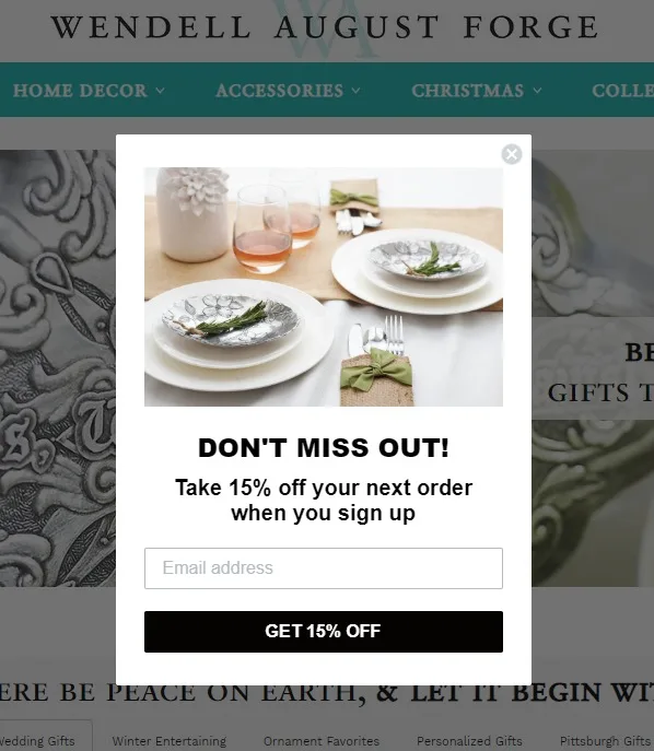
What’s more, by leveraging the fear of missing out, or FOMO, the brand not only urges their visitors to join — but it also sends a message that the brand is worth their time and money.
Using clever signup offers and promoting giveaways through your newsletter signup forms will help your visitors realize the value of your online business.
So, next time you need to boost your subscriber count, give them an irresistible prize and see your number grow.
6. Use the right number of fields.
Collecting valuable information about your new subscribers is a must for content marketers who want to deliver tailored content and improve marketing collateral in general.
But to create high-converting newsletter signup forms, you need to find the golden ratio of form fields.
Too many fields will turn your form into a complex, time-consuming process that no one wants to go through for a 10% or 15% discount.
Add only the fields that are necessary to collect your newsletter subscribers’ emails and basic information.
Getting their first name and gender is a great way to get started with segmentation and personalize your first campaigns. According to email marketing statistics, personalizing your content will give you 29% more open rates that will lead to more engagement and happier subscribers.
If you feel you need more than that, you can always send your new newsletter subscribers a new campaign asking for more information.
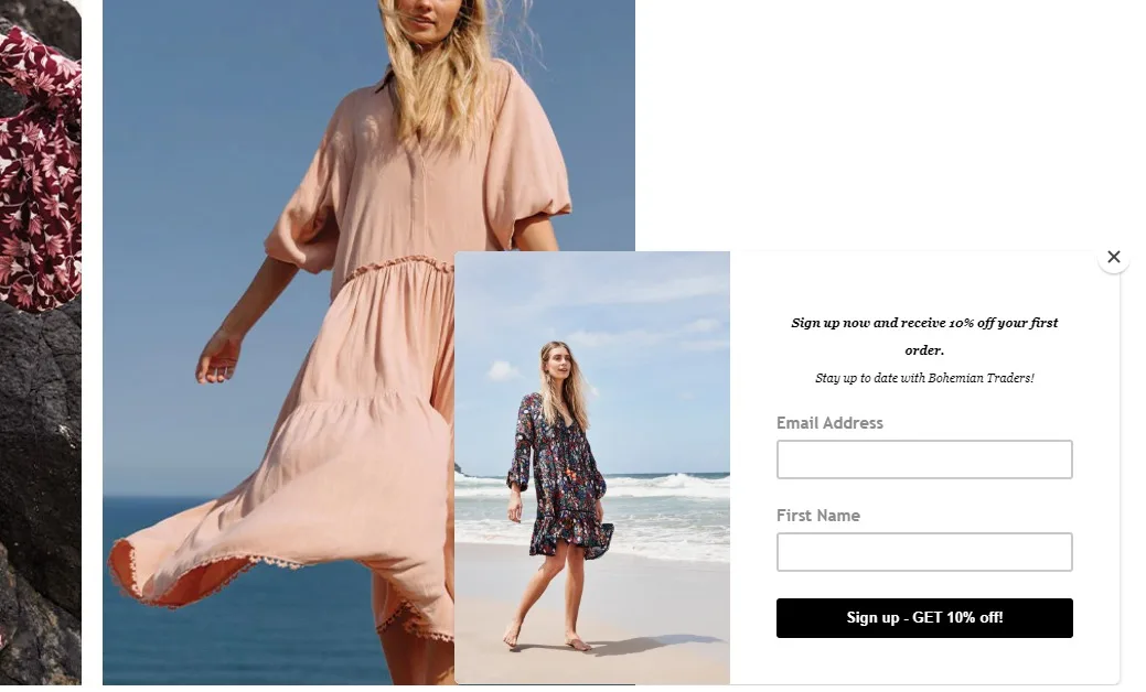
Bohemian Traders newsletter signup example.
Creating short forms that require minimal engagement can effectively boost your newsletter signup rate .
Bohemian Traders, in this case, has a great floating box form on its homepage that includes only the most necessary fields.
While the brand only has a first name field, you need to keep in mind that if you want to add a first and last name field, you should align them horizontally to avoid making your form appear lengthier.
7. Leverage the power of social proof.
When it comes to trying new things, consumers will always try to find out about others’ experiences. People heavily rely on the opinions of others to determine if something is worth their time.
This represents what we call social proof, a psychological and social phenomenon wherein people assume that the actions of others are correct in a given situation.
As a content marketer, you might have leveraged social proof to increase the credibility of your store through consumer reviews, star ratings, and testimonials.
But, what if I told you that you can also use social proof to create the best newsletter signup ever?
Using social proof as part of your signup page will show your potential buyers that you are a legitimate and trustworthy business.
The only thing you need to insert social proof into your forms is a review or the number of your satisfied customers.
Especially for ecommerce stores, featuring a positive online consumer review will help your newsletter subscribers realize the value of your products and get them to join your mailing list for more news and special offers.
Proactiv email newsletter signup example.
Consumer reviews, testimonials, and statistics are great. However, there’s something even more powerful than you can leverage to create the best email newsletter signup page for your new leads.
Proactiv takes advantage of their customers’ experiences to create the ultimate form of proof: the word of your satisfied customers.
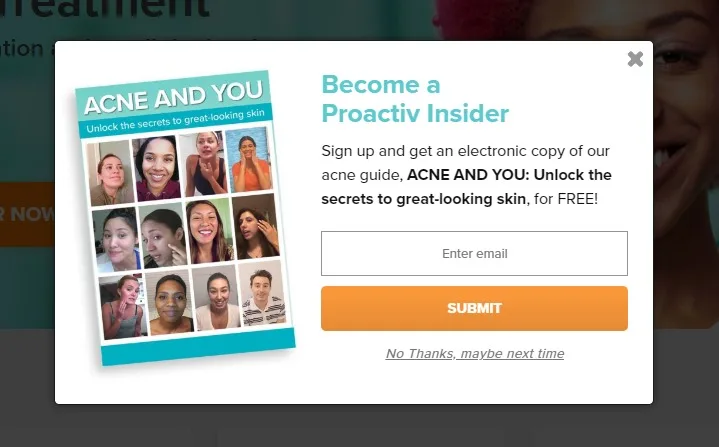
As visual creatures, consumers need to see an immediate benefit. By adding visual proof, the brand nails its form and increases its subscriber count relying on the this-could-be-you mentality.
Promote Your Email Newsletter Signup
You only need to display your form on your homepage or product page to get your visitors to sign up for your emails. But to take it a step further, you can also leverage the power of social media to boost your subscriber count.
Take advantage of your Facebook profile to promote your signup rate and turn your social media followers into your newsletter subscribers.
Here’s how Moonpie does it:
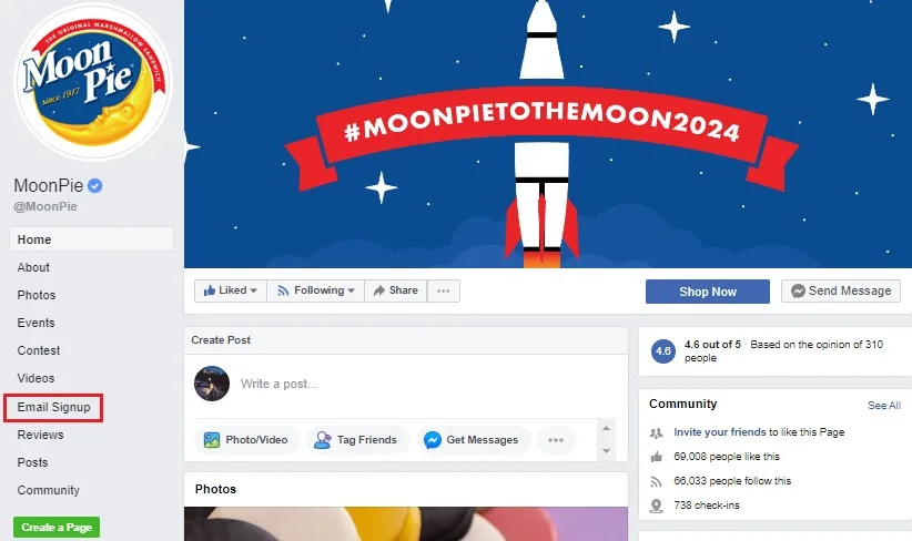
Adding a dedicated newsletter signup tab on your social media profile will help your followers click on it.
When they do, make sure that you have created and connected your tab with a high-converting form to convince your social media followers to provide you with their email address and get a step further down your marketing funnel.
Sounds easy as pie, doesn’t it?
Takeaways
If you want to make the best newsletter signup for higher conversions, you need to understand best practices that every content marketer should use.
The perfect form starts with simplicity, a great color combination, and even greater copy. Pay attention to detail, and create forms to attract attention and encourage subscription without second thoughts.
Rewarding your newsletter subscribers with a nice signup offer and using social proof to show them the value of your business will also help you rock your email newsletter signup form and skyrocket its efficiency.
If you haven’t already created your newsletter signup form, take a look at these steps and examples, set your goals and you’ll have a high-converting newsletter signup form to capture your audience’s hearts and email addresses in no time!

Marilia Dimitriou is a creative writer working for email marketing automation software Moosend. Her passion for writing has made her find new ways to combine the art of creative writing with SEO copywriting. When she’s not writing articles, you’ll find her enthusing over marketing tech and automation.
