7 Product Filtering Implementations That Make Macy’s Best-in-Class

This post originally appeared on the Baymard Institute Blog.
When testing 19 sites and benchmarking 50 major ecommerce sites on product lists and filtering usability, my team over at Baynard Institute found that 84% of the sites had a mediocre or poor product filtering experience. The most common culprits were: a lack of key filtering options, poor filtering designs and filtering logic that doesn’t align with users’ expectations.
Analyzing the 1,750 manually reviewed product filtering UX parameters in our product lists benchmark, we found that:
[inlinetweet prefix=”” tweeter=”” suffix=””]34% of websites have a poor filtering experience[/inlinetweet], severely limiting their users’ ability to browse products when they have even the most basic of product requirements
[inlinetweet prefix=”” tweeter=”” suffix=””]50% of websites offer a passable filtering experience[/inlinetweet] — by no means good and with several areas that could be improved
[inlinetweet prefix=”” tweeter=”” suffix=””]Only 16% of websites provide a good product filtering experience[/inlinetweet], with sufficient filtering types available, a balanced filtering design and a filtering logic that aligns well with user expectations
Luckily, there are a few sites that stand out from this generally sad state of affairs and provide their users with an overall great filtering experience. One of those sites is Macy’s. Macy’s ranks #4 when measured on “Filtering” performance in our product list and filtering benchmark of 50 major U.S. ecommerce sites.
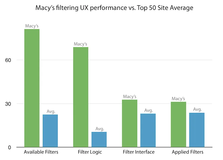
The “Filtering” experience scores are based on 35 filtering usability guidelines, divided into 4 themes: Available Filters, Filter Logic, Filtering Interface, and the Applied Filter State. Across all 50 ecommerce sites benchmarked this gives us 1,750 performance scores for analysis. In this graph we’ve summarized the scores across the 4 filtering themes, and segmented out Macy’s scores for comparison against the average top US e-commerce site.
It’s clear that Macy’s great product filtering performance is mainly due to significantly better filter availability and logic –– 350% and 650% respectively, over the performance average score of the remaining 49 top US ecommerce sites.
In this article, we’ll explore Macy’s filtering experience to see what we can learn. Also, note that Macy’s overall filtering design is rather conventional and thus representative of most ecommerce platforms, making the case study relevant to ecommerce sites at large.
We’ll cover seven concrete product filtering implementation aspects at Macy’s which during our usability testing were identified to be the high-performing designs. This includes best practice examples of the available filter types, the filtering interface, applied filter state, promotion of popular filters, the user’s back button expectations and more.
Provide Category-Specific Filters (42% Don’t)
Most of the time, users are interested in filtering a product list across category-specific attributes, and not just a few generic site-wide attributes such as brand, price, user ratings, etc. For a category like “Coats” that might mean the ability to filter by “Material,” while for “TVs” it could be the “Refresh Rate,” and for “Bowls” one could easily imagine filtering by “Volume” capacity.
42% of major ecommerce sites lack category-specific filtering types.
These would all be examples of what we call “category-specific filters.” They are filter types that are specific to those particular categories. For instance, it wouldn’t make sense to have the ‘Refresh Rate’ filter from ‘TVs’ appear when in the ‘Bowls’ category because it is a product attribute specific to TVs and therefore isn’t relevant to kitchenware.
A staggering 42% of major ecommerce sites lack category-specific filtering types for several of their core product verticals. With product filtering options this basic missing on so many sites, it’s easy to understand why 84% of sites still have far to go when it comes to their overall filtering experience.
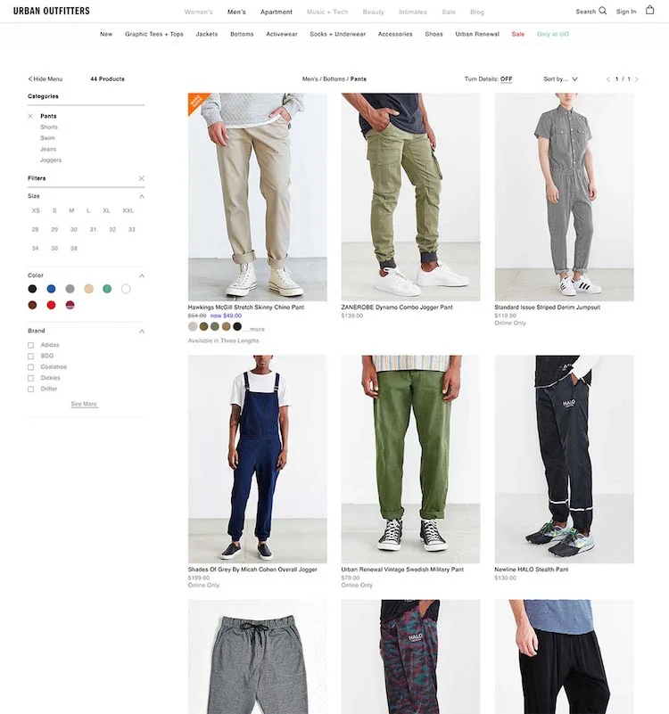
Urban Outfitters doesn’t have a “Fit” filter in their pants category despite including this attribute in nearly all product titles. Without an option to filter by “Skinny” fit or “Regular” fit pants, users are forced to browse a generic list of all of Urban Outfitters’ pants and mentally keep track of which items are relevant to them and which aren’t.
Generally, we’ve found during usability testing that any product specification that is important enough to be shown in a product list item should also be available as a filter. Not only because the information types in the list item are –– or at least should be –– the product attributes the user cares the most about, but also because testing revealed that the mere display of certain product attributes increased the subjects’ desire to filter by those attributes.
By virtue of highlighting the product attribute to the user, you remind them that the spec is important (or in the case of users new to the domain, teach them that it is), and the very display of the spec therefore encourages users to filter by it. For instance, if a collection of bed sheets has “Thread Count” displayed in each list item, users will be more likely to want to filter that product list by “Thread Count.”
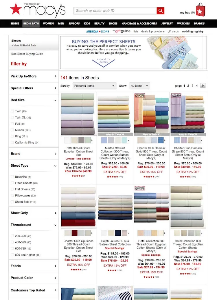
Looking at Macy’s, we can see how they offer both category-specific filtering and allow their users to filter by the attributes displayed in the list item. Notice how the list items display sheet type, fabric and thread count –– and how Macy’s also offers category-specific filters for all of these product attributes.
Tip: To read more on our test findings on category-specific filters, see our article posted at Smashing Magazine.
Promote Important Filters on Top of the Product List (84% Don’t)
Often, the product list of a given category or a set of search results will have a handful of filters which are highly beneficial for the majority of users to consider applying, as it will vastly increase the relevancy of the items in an otherwise very generic product list. For example, if a user navigates to a “Digital Cameras” category, “Camera Type” would be a highly important filter type, since the user’s needs will vary greatly depending on whether they are looking for a “Point & Shoot,” “DSLR” or “Mirrorless” camera.
It’s a good idea to promote particularly important filters or filter combinations.
Only displaying these as traditional filters in a product filtering sidebar increases the risk of users overlooking the options or not understanding the importance of making the selection. During our ecommerce usability tests, we typically observe that users perceive categories as something the site suggests they select whereas the filtering sidebar options are seen by most users as purely optional choices. It’s therefore a good idea to promote particularly important filters or filter combinations on top of the product list to encourage their selection.
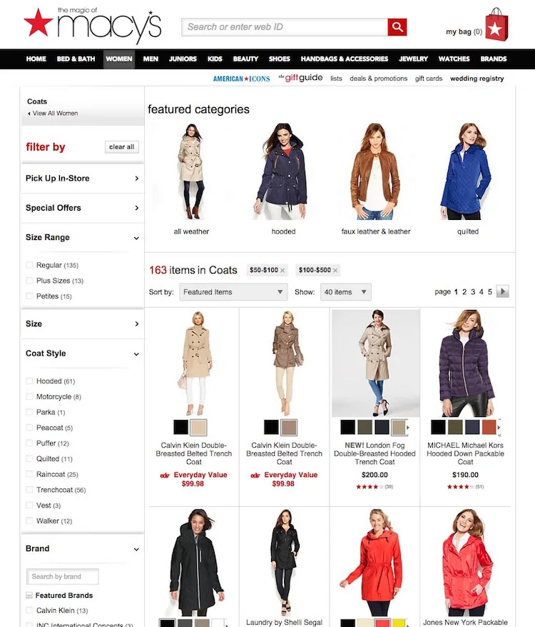
During testing, a very clear pattern emerged on how a limited set of highly important filters can be given extra exposure: by highlighting them above the product list. We once again find an example of this at Macy’s, where a select number of coat style filters are promoted in the Coats category. Note: they are filters despite Macy’s calling them “featured categories.”
The test subjects often interpreted this type of promoted filter as the site encouraging them to select one –– and consequently sites with such promoted filters saw much higher filter utilization rates than sites that didn’t promote them. Despite this being a very effective nudging technique, only 16% of ecommerce sites currently have “promoted filters.”
Only 16% of ecommerce sites currently have promoted filters.
A word of caution though: the vast increase in attention and utilization that promoted filters receive means that they should be used sparingly. It is only when the vast majority of users will benefit greatly from applying one of the promoted filters that they should be there. Otherwise, users are simply lured into overly narrow product lists –– which is a very severe product browsing issue that we often observe leading to site abandonments. It’s therefore an absolute no to promote only moderately important filters.
When implementing promoted filters there are four details of which it’s particularly important to be mindful:
Significance Over Consistency: The promoted filters don’t necessarily need to be of the same type. It’s all about promoting the most important product concerns to the user, which in some cases might mean promoting filters of different types or even combining multiple filters into one. For instance, Walmart promotes a fairly diverse set of filters in their laptop category: ‘Touchscreen Laptops’ (feature filter) to ‘Chromebooks’ (Operating System filter) to ‘11-14″ Laptops’ (screen size filter).
Careful Curation: Because many users will perceive the promoted filters as site “recommendations,” it is essential that they only appear when there are truly meaningful selections to be made. The promoted filters therefore need to be very carefully curated and may in some product verticals require on-going review. (Note: the filters will of course very often be category-specific filters, which we described in section #1 of the article).
Keep in Original Position: The promoted filters should alway be displayed in the product filtering sidebar as well (i.e. in addition to the “promotion” placement). Through two decades of browsing ecommerce sites, most users have been trained to reach for the filtering sidebar when they want to narrow down their product list, and some users will therefore only look for a filtering value there.
Avoid Banner-Like Graphics: A few of the test sites promoted filters in banner-like graphics. Unfortunately, these were consequently completely ignored by the test subjects – presumably due banner blindness. For examples of this, see our article Avoid These 5 Types of Ecommerce Graphics which dives deep into our test findings on that topic.
Note: A few sites will be able to use a horizontal product filtering toolbar – as described in Filtering UI: A Horizontal Toolbar Can Outperform the Traditional Sidebar – which eliminates the need for promoted filters.
Allow Users to Apply Multiple Filter Values of the Same Type (32% Don’t)
When it comes to product filtering logic, the filtering values should, in general, not be mutually exclusive within the same filter type.
During testing, filtering values wrongly implemented as being mutually exclusive caused site abandonments as the test subjects couldn’t establish an overview of the products that matched their unique set of product requirements. When filtering values within the same filter type are (wrongly) implemented as mutually exclusive it forces users to go through a needlessly demanding product filtering flow:
At the unfiltered product list, the user first has to apply filter value 1
Then the user must look through the products in the filtered list, and
Memorize the interesting products for filter value 1
Then the user must de-select filter value 1 and wait for the page to reload to see the prior product list without any filters
Then apply filter value 2 at the now unfiltered product list
Look through the products in this new filtered list, and
Memorize the interesting products for filter value 2
Finally, the user must now mentally combine the two memorized product matches to get an overview of the products relevant to their needs
And that is when the user wants to apply just two filtering values –– imagine how complicated this gets when they are interested in more than two filtering values of the same type! Now, before thinking that such poor filter implementations never occur, our benchmark revealed that one third (!) of the 50 top grossing U.S. ecommerce sites have such implementations –– wrongly implementing most or all of their product filtering values as mutually exclusive. Unsurprisingly, this severely obstruct their users’ filtering –– and thus product finding –– abilities.
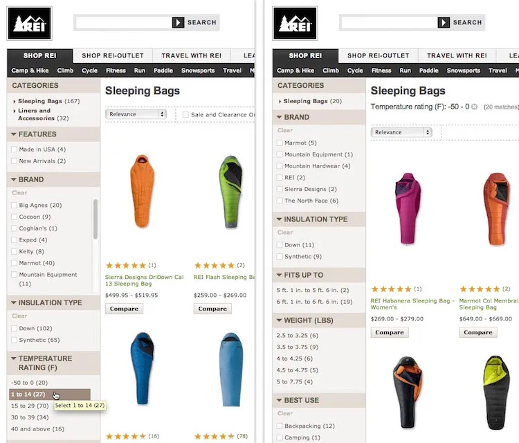
REI has wrongly implemented many of their filtering values as mutually exclusive. Here a subject wanted to apply two different temperature filtering values (first image). But as soon as he selected “-50 to 0”, the entire “Temperature” filter type disappeared (second image), making it impossible to apply multiple values within the same filter type.
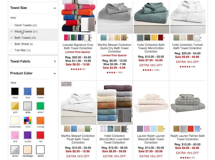
Now, compare the prior described process, to one where multiple values within the same filter type can be applied (as seen in above Macy’s example):
At the unfiltered product list, the user applies the 1st filtering value within the filter type, (in the Macy’s example, “Bath Towels”)
The user applies the 2nd filtering value, (in the Macy’s example, “Wash Towels”), and
Can now look through all the products in the combined filtered product list
45% of users combined multiple values within the same filtering type where it was possible.
During the test sessions, 45% of the test subjects combined multiple values within the same filtering type on the sites where it was possible. Some of these subjects even got a little creative and used this feature as a way to filter out unwanted product variations by applying all other / opposite filtering values. For example, if a subject didn’t want light-colored towels, they would weed out these products by applying all of the other color options.
Have Thematic Filters (20% Don’t)
Thematic browsing patterns are quite common in physical retail, where any sales assistant will be able to help store visitors with common requests such as “a casual shirt,” “spring jacket,” “high-end pocket camera,” “value-for-money LED TV,” etc. Yet despite such thematic attributes often being both common and central aspects of the user’s purchasing decision, our benchmark reveal that 20% of the top ecommerce sites lack thematic filters. Support for it has increased by 18% since our study on Ecommerce Search.
While TVs, cameras, jackets and shirts can all be easily located on most ecommerce sites, only seeing products that match a certain “theme” will be next to impossible for users if the site doesn’t offer thematic filters.
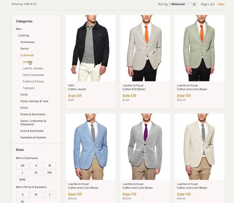
“I’m too impatient for this kind of thing. They would have lost me. [..] Normally you can choose between winter jackets, spring jackets or the type of jacket,” one of the test subjects explained while looked for a spring jacket on Gilt. He ended up abandoning the site.
Without thematic product filtering options, it is often unreasonably time consuming for users to see only the products of interest to them. During testing, a lack of thematic filters often led to site abandonments because the subjects prematurely concluded that the store either didn’t carry the type of products they wanted (e.g., spring jackets), or, more often, that it would be nearly impossible for them to find the few relevant items that might be hidden somewhere in those vast product lists.

Macy’s offer us a classic example of thematic filters in the apparel industry: occasion. By having ‘Dress Occasion’ filters it is easy for users to see dresses suitable for as diverse occasions as a “Night Out” and “Wear to Work”. During the test sessions, thematic filters saw very high utilization rates (above 50%) by the subjects – that is, on the sites that offered them.
Thematic filters have high utilization rates –– at above 50% of users.
Because thematic filters tend to be very context-dependent in nature they will typically have to be tailored uniquely to a site’s product catalog. However, some common examples of thematic types are style (casual, romantic, modern, etc.), season (spring, holiday, etc.), usage conditions (outdoors, underwater, etc.), and purchase selection parameter (cheapest, value for money, high end, etc).
Display Applied Filters Both in Their Original Position and in an Overview (42% Don’t)
When users apply filters and browse the product list it is essential that they can easily find all of the applied filters and that they are reminded of them – otherwise the user may end up severely misinterpreting the site and its product catalog. Our usability testing showed that for an “applied filter design” to be user-friendly it has to meet a handful of requirements:
Make sure the user can easily find any currently applied filters.
Make it clear exactly which criteria the currently displayed product list is filtered by.
Allow the user to easily deselect applied filters.
Provide the user with additional context when selecting new filtering values.
Help the user infer how much of a filter type’s “range” is currently selected.
The test sites that both displayed the applied filters in their original position in the product filtering sidebar, and displayed a summary of all applied filters at the top of the product list, had a vastly lower rate of user errors and misinterpretations than the sites that displayed applied filter in only one of these positions.
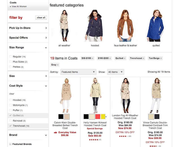
During testing of Macy’s, the different test subjects relied on either the left sidebar filters or the top summary position of the applied filters. This was the case both when inferring what filters were currently applied and when the subjects were looking for a way to deselect filters. Once again underscoring the importance of displaying applied filters in both positions.
While seemingly simple, 42% of ecommerce sites only display applied filter in one of these positions – despite the rather severe usability issues that can arise as a consequence. You can find see the whole set of test findings in our recent article on How to Design ‘Applied Filters.’
Truncate Long Lists of Product Filtering Values (26% Don’t)
When a list of product filtering values get much longer than 10 values all our eccommerce usability studies have shown that issue will arise if:
All the filtering values are simply displayed in one long list because this pushes all other filter types out of view. Luckily only 2% of sites do this.
The filtering values are displayed using an inline scrollable area. This approach of “scrolling within scrolling” is difficult for users to grasp and even more difficult for them to actually interact with. Inline scrollable is currently being used for long lists of filters by 24% of ecommerce websites.
Luckily, testing also revealed a design pattern that did work well: truncation of the filters. However, truncation only outperformed the two other design patterns when a number of truncation design guidelines were met.
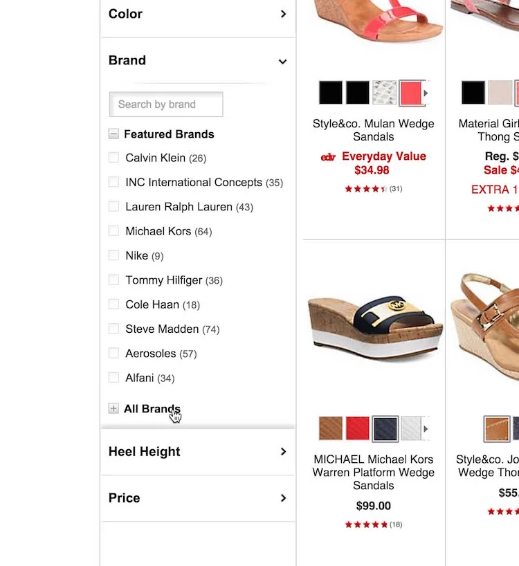
Macy’s truncation implementation is decent. When looking at the 6 truncation design guidelines they get the following right:
Macy’s displays up to 10 values before truncating. Around 10 values is the sweetspot. Having too few visible values was observed to confuse users and hide too many options. Meanwhile displaying much more than 10 values impeded the user’s overview of the other available filtering types (the reason for truncating the list in the first place).
The truncation link “All Brands” is styled differently than the filtering values (in bold) to make it clear to the user that this is not just the last filtering value.
Macy’s visually indicates that additional values are currently hidden and can be expanded by using a + icon.
To perfect their truncation design Macy’s could consider either rewriting the “Show All Brands” link to include the total number of brands available or visually fade the last visible filter value –– two details which during test proved to increase emphasis on the list of filters only being partially displayed. Also the proximity could be tweaked (e.g. by adding slightly more white space below the truncation link) to make it abundantly clear that the “All Brands” option belong to the list of filters above it and isn’t a standalone option or related to the items below.
Filter Changes Should Be Separate Events in the Browser History (34% Don’t)
During our usability studies, we time and again see test subjects relying extensively on the browser back-button. This of course isn’t a problem in itself. However, we frequently observe confusion, disappointment, anger and even abandonments, when a site’s technical implementation break with the user’s expectations of how the back button should function.
Generally users expect the back button to take them back to what they perceive to be their previous page. And this is where the typical misalignment occurs: when users click a button or a link, wait for content to load, and then see an overall set of new content, they expect it to be a new view that they can click “back” to –– regardless of whether it is technically the same page or not.
Users expect the back button to take them back to what they perceive to be their previous page.
As applying filters generally include a click, content loading, and a new set of visual content, it should come as no surprise that users consistently during testing perceived this as a new page. And as a consequence the subjects naturally tried to click “back” to previous filter states. Unfortunately, one third of the leading ecommerce sites break this expectation.
It’s worth noting that even on the test sites that updated the product list live using AJAX (and not a full page reload), the subjects still generally perceived each iteration of their filtering process as a new view.
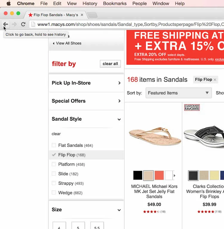
To align the back-button behavior with user expectations during filtering, Macy’s invokes a URL rewrite for each filter applied. Something 66% top ecommerce sites do. This is typically done using the HTML5 History API, which enable sites to invoke a URL change without a page reload, making it possible to add each filter and sorting change as a separate entity in the user’s browser history without invoking needless page reloads.
Improving the User’s Product Filtering Experience
The user’s product filtering experience is a central part of the product browsing experience. When done well, filters can empower users to narrow down a product catalog of thousands to just a handful of products that match their unique purchasing preferences.
Yet despite filters’ obvious importance to the user’s product finding abilities, only 16% of the leading ecommerce sites that deliver a great overall filtering experience. Macy’s is one of those few sites with particularly good filter availability and product filtering logic.
While the list is long, some of the points that makes Macy’s filtering experience stand apart are:
The availability of category-specific filters, e.g. a “Thread count” filter within a “Towel” category. In comparison, 42% of eccommerce sites don’t have category-specific filters for one or more of their core product categories.
In select categories, where the majority of users’ will benefit from choosing among a particular set of filters, Macy’s promote such filters above the product list. 84% of ecommerce sites don’t utilize this nudging technique.
Macy’s allow users to apply multiple filtering values of the same filter type (and at the same time). While seemingly basic, 32% of sites don’t offer their users these capabilities.
Users’ desire for thematic browsing is supported through thematic filters, such as “Style” filters, allowing them to see only a “thematic subset” of products within a product category. Among general ecommerce sites, 20% don’t have such thematic filters despite selling products with obvious thematic attributes (e.g. season or style).
As users apply filters, the applied values are shown both in a combined “applied filters” overview and in their original position among their unapplied siblings. A design that outperforms only displaying it in one of these positions. 42% of the benchmarked sites fail to do this.
Long lists of filtering values, such as “Brands”, are truncated after the 10th filtering value to avoid users losing overview of their filtering options, or causing extensive interaction issues with inline scrollable areas.
As users apply filters, each change is added as a separate event in the user’s browser history (without page reloads), keeping user expectations and site behavior in alignment.
Although Macy’s product filtering experience is good, there’s of course still room for improvement. For example there’s a noticeable lack of compatibility filters for the compatibility-dependent products they sell. For instance, phone cases don’t offer filters for phone model or device size, making it virtually impossible to see only the cases relevant to the user’s specific phone. There’s also a lack of a “New Arrivals” filter, which during testing proved immensely popular and powerful in combination with other filters – in particular on seasonal sites like apparel and home decoration.
If you’re looking for inspiration on filtering availability, logic and interfaces, the other benchmarked sites that also have a great overall filtering user experience are: Sears, L.L.Bean, Wayfair, Nordstrom, and Amazon.
For Bigcommerce merchants, we have multiple integrations and partners that can provide the above functionality, most notably Nextopia. You can download that app here.
Photo: Flickr, Phillip Pressner

Christian Holst is the co-founder of Baymard Institute, where he writes bi-weekly articles on web usability and ecommerce optimization. He's also the author of the Ecommerce Checkout Usability and Mobile Ecommerce Usability research reports.
